VI Front Panels
Contents
- Consistently Place Common Controls and Indicators in the Same Location on Each Front Panel
- Set Default Values for Each Control. Do Not Set Default Values of Indicators Like Graphs, Arrays, and Strings.
- Use the Appropriate Display Format for the Control
- Ensure Font Settings Do Not Cause Front Panel Objects to Overlap
- Ensure All Front Panel Controls are Visible on the Front Panel
- Align and Distribute the Controls for Better Front Panel Layout
- Use Default Colors and Add Color Sparingly
- Be Consistent When Using Modern 3D Controls
- Save the VI so the Front Panel Opens in the Top Left Corner of the Screen and Fits Within 1024x726 Resolution
- Use a Consistent Style for all Boolean and Numeric Controls
Consistently Place Common Controls and Indicators in the Same Location on Each Front Panel
- Include the VISA resource name out in the upper right corner, error in in the lower left corner, and error out in the lower right corner.
In addition to establishing data flow between API VIs, the VISA resource name and the error clusters provide both interactive and programmatic use of the instrument driver. To use the VIs interactively, users select an open resource name from the VISA resource name ring control. The error out VI informs the user if an error occurred while running the API VI. Placing these controls and indicators in same location on each VI helps users focus on the controls that differ in each VI. Use the instrument driver templates when creating new API VIs. The standard controls in these templates contain complete descriptions that appear in the Context Help.
Besides the VISA resource name and the error clusters, place other standard controls in the same location on the front panel. For example, channel-based instruments often have multiple VIs that include a channel input, so place the channel control in the same location on each VI.
Set Default Values for Each Control. Do Not Set Default Values of Indicators Like Graphs, Arrays, and Strings.
- Choose a default value whenever possible so the VI does not return an error when run.
To set default values for controls enter the default value in each control, select Operate»Make Current Values Default, and save the VI. Enter common user settings for the instrument driver as default values. This reduces unnecessary wiring for the end user. Do not set default values in indicators or large data controls (except in examples) such as graphs and arrays because doing so uses disk space when you save the VI.
Use the Appropriate Display Format for the Control
Recommended
- Use automatic formatting for numeric controls and indicators.
- Use the same display format for common or similar values throughout the instrument driver VIs.
Right-click the control and select Format and Precision and select Automatic formatting in the Format and Precision tab unless the control requires a specific format. For most numeric controls and indicators, the Automatic Formatting option displays the numeric in the format that LabVIEW determines as most appropriate for the data. However, use a different format if appropriate. For example, users might expect numbers to appear in hexadecimal format. In this case, configure the numeric indicator to use the hexadecimal format, but right-click the control and select Show Radix from the shortcut menu to let users switch between formats easily.
Ensure Font Settings Do Not Cause Front Panel Objects to Overlap
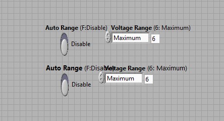
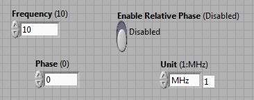
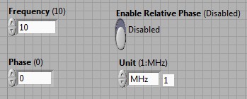
To create a professional panel, keep the front panel simple. Do not overlap controls on other controls, labels, digital displays, or other objects. Overlapped controls redraw slowly and make the front panel appear cluttered. Give each object a 33 percent cushion of space to account for font size changes. The figures below illustrate how overlapping text occurs when the system font size changes.
Ensure All Front Panel Controls are Visible on the Front Panel
Do not hide controls and do not move controls outside the visible area of the front panel. Hidden controls confuse users and make debugging VIs difficult. For example, do not hide the error in control or place the control outside of the visible area to conserve front panel space. If you open the front panel of a subVI with a hidden error in control, you cannot determine from the front panel whether an error occurred before the subVI executed or when the subVI executed.
Align and Distribute the Controls for Better Front Panel Layout
Use the Align Objects tool and the Distribute Objects pull-down menus to create a uniform layout. The front panels in the figures below demonstrate how aligning controls can improve front panel appearance.
Use Default Colors and Add Color Sparingly
Recommended
Avoid bright colors because they might distract the user. Also, bright colors appear poorly on certain types of monitors or during printing. When possible use the LabVIEW default colors.
If you do use additional colors, ensure they appear as intended when printed on a black and white printer. Do not use color as the sole indicator of device status as some people with color-blindness can have problems detecting the change. Some of the colors on the front panel in the figure below do not appear as differentiated when printed with a black and white printer.
Be Consistent When Using Modern 3D Controls
Using a consistent style of control helps create a professional-looking user interface.
Save the VI so the Front Panel Opens in the Top Left Corner of the Screen and Fits Within 1024x726 Resolution
Recommended
Front panels should fit within the standard monitor resolution of most of the users. Some displays, such as LCD displays and touch screens, have limited resolution, so design the window to be as small as possible without crowding controls or sacrificing a clear layout. Save the VI so that it opens in the upper-left corner of the screen to ensure most users can view the entire front panel without scrolling.
Use a Consistent Style for all Boolean and Numeric Controls
- Use the vertical slide switch for Boolean controls.
- (Recommended) Use the control properties to set Show Boolean Text. Set appropriate labels for On Text & Off Text. Place Boolean text to the left or right of the control. Place Boolean text to the right of the control.
- (Recommended) Use the Round LED for Boolean indicators.
Use the vertical slide switch Boolean control because it lets users easily identify the current state of the control. Avoid using buttons to represent Booleans.
You can label a Boolean by setting the properties of the switch. Right-click the control and choose Properties to display the Boolean Properties dialog box. On the Appearance tab, place a checkmark in the Show Boolean Text checkbox and the Multiple strings checkbox. Enter the label for your True value in the On text textbox and the label for your False value in the Off text textbox. Use the default ON/OFF values when appropriate. Click OK to save the changes. Move the Boolean text label to the right of the control.


