Statistical Visualization in LabVIEW
Overview
Statistical visualization is a useful framework for gaining valuable insight into data and for helping you choose technique for further analysis. This framework provides a way to see data so you do not have to rely on abstract numerical values. Data visualization is becoming increasingly important to modern statistical analysis. An entire branch of statistics, exploratory data analysis (EDA), evolved when mathematicians discovered they could use computers to create graphical plots of data quickly. By highlighting patterns and trends, these plots provide an intuitive way to understand the core statistics of any data set.
LabVIEW provides many VIs for several types of statistical analyses, such as mean and standard deviation. These numerical statistics involve straightforward computation, making them the basis for traditional statistical analysis. LabVIEW also has a powerful means of displaying data that allows it to address the visual nature of EDA statistical techniques. For example, you can use LabVIEW to construct run sequence plots, scatter plots, boxplots, steam-and-leaf displays, histograms, lag plots, normal probability plots, and quantile-quantile plots. This document provides information about each of these display types.
The Exploratory Data Analysis VI example shows you how to use each of the statistical visualization techniques discussed below. This example program can be found in filepath <labview>\examples\Mathematics\Probability and Statistics\Exploratory Data Analysis.vi.
Contents
- Run Sequence Plots and Scatter Plots
- Boxplots and Stem-and-Leaf Displays
- Histograms
- Lag Plots
- Normal Probability Plots
- Quantile-Quantile Plots
Run Sequence Plots and Scatter Plots
Most EDA starts with a run sequence plot. This plot displays data in the order that you observe it. Although simplistic in nature, this you can use this plot to detect outliers in the observed data. Outliers are data points that are usually many standard deviations from the mean and can therefore represent a serious measurement error. The left plot in the following figure is a run sequence plot. This plot shows data that varies around a central value with no suspect values in the data.
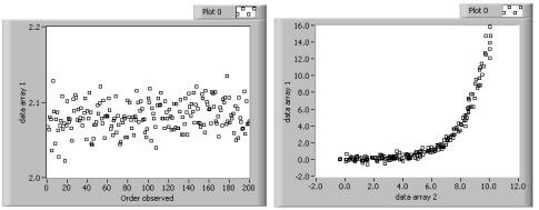
A scatter plot is a generalization of the run sequence plot. This plot displays two sets of data against each other. You pair data points from each set to form an ordered (x, y) pair that you then plot. In LabVIEW, this process is equivalent to creating an XY graph. Generally, the data sets are different observations from the same event. For example, you can use a scatter plot to compare the fuel consumption and velocity of an automobile. You usually choose data point pairs based on when the data was observed. The right plot in the previous figure is a scatter plot that shows an exponential relationship between the two data sets. You can use future statistical analysis of the data sets to investigate this relationship. Refer to the Run Sequence Plots and Scatter Plots section, linked below, for more information about creating run sequence plots and scatter plots in LabVIEW.
Boxplots and Stem-and-Leaf Displays
Boxplots display basic summary statistics of a data set in the form of a rectangular picture. You can gain an intuitive understanding of a data set from boxplots because they de-emphasize exact data points and display the data in a unique manner. The left plot in the following figure is an example of a boxplot. The rectangle represents where the center 50% of the data points lie. The horizontal line in the center rectangle represents the median of the data set. The long vertical lines are called whiskers. Whiskers have a length of 1.5 times the inner quartile spread, which is the difference between the upper quartile and the lower quartile. You measure whiskers from the median of the data. The whiskers are indirect plot indicators because you use other statistics to generate them. However, whiskers are useful because they display the distribution of the data in a clear manner. An X indicates a potential outlier, which is outside the range of the whiskers.
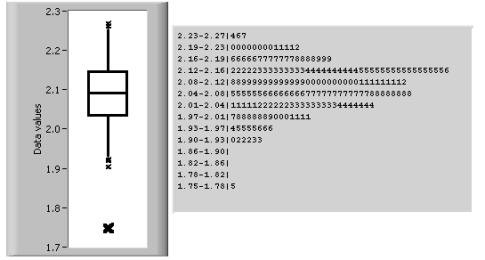
Boxplots are valuable because they quickly show the median, upper and lower quartiles, and potential outliers of the data set. Data that is skewed upward or downward on the range has a boxplot in which the median does not divide the box evenly. Although an evenly divided boxplot can give the impression of a normally distributed data set, the boxplot still suppresses the exact values of the data set. You can overcome this weakness in the boxplot by creating a stem-and-leaf display, shown as the right display in the previous figure.
Technically, stem-and-leaf displays are not plots because they are text-based. However, stem-and-leaf displays indicate every data point, which is useful for determining exact values and seeing the distribution of the data. You construct stem-and-leaf displays by dividing the data set in to ranges, or stems. Each stem has a number of leaves, or data points. A leaf is the least significant digit of the stem value. For example, in the previous figure, the first stem is the range from 2.23—2.27. This stem contains three leaves: 2.24, 2.26, and 2.27.
See Also:
Boxplot and Stem-and-Leaf Display
Histograms
Histograms are similar to stem-and-leaf displays, because each display indicates the number of data points that fall within a specific range. However, instead of showing specific values, a histogram shows this frequency information in the form of a bar graph. Histograms are useful for getting an idea of the distribution of the data set. As the figure below shows, the histogram on the left is roughly bell-shaped while the histogram on the right has two distinct peaks.
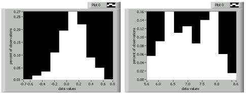
You can represent a histogram in several different ways. Originally, histograms showed the count, or number of points, that fell within a specific range. This method was difficult to use when comparing distributions of data sets having different number of observations. Therefore, statisticians now more commonly divide the histogram count values by the number of observations. This method normalizes the frequency information into fractions of the total sample size.
Lag Plots
Lag plots are displays that pair one data point with another point that is n observations away. You can use lag plots to investigate time-delayed relations between data points. Lag plots are useful for analyzing data you suspect to be cyclic in nature. For example, a lag plot can relate data points that are four observations apart. Lag plots that form a loose cloud of points indicate no delay or lag relationship. Lag plots that form a line or ellipse indicate a strong delay or lag relationship. The lag plots in the following figure show two cyclic data sets.
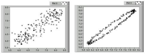
In the previous figure, the plot on the left has a loose cloud of points that form a rough line. From this plot, you can reasonably conclude that the data sets are somewhat related over time. In the lag plot on the right, the data points form a clear oval, which indicates a strong time-delayed relationship. Once you detect lag, you can use special statistical techniques to perform further data analysis.
Normal Probability Plots
Normal probability plots compare the distribution of an observed data set to an ideal, normally-distributed data set. You can create a normal probability plot by forming an artificial data set representing normally-distributed data with the same number of points as the original data set. You then order the original data and, as with the scatter plot, pair each point from the original data set with the corresponding point in the artificial data set. You then plot the pairs. The following figure shows two normal probability plots.
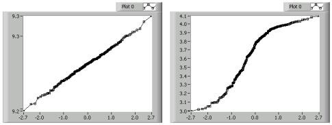
In the previous figure, the plot on the left is a line. Straight lines that follow the 45-degree diagonal indicate that the observed data set is normally distributed. The plot on the right is S-shaped, which indicates a data set that has too many points at its extreme ranges to be considered normally distributed. Plots that are concave down, as in the right plot of the previous figure, indicate data that is skewed to the upper part of the range. Conversely, plots that are concave up indicate data that is skewed to the lower part of the range.
Quantile-Quantile Plots
Quantile-quantile plots are useful for determining if one data set is more skewed than another. These plots are similar to normal probability plots. However, instead of comparing the distribution of one data set to an ideally-distributed set, quantile-quantile plots compare the distribution of two sorted data sets against each other. If you have data sets of unequal size, you can interpolate the larger set based on the smaller data set to provide the necessary data pairs. The following figure shows two quantile-quantile plots.
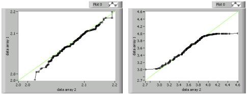
You interpret quantile-quantile plots in the same way you interpret normal probability plots. Therefore, quantile-quantile plots that are straight and follow the 45-degree line, such as the left plot in the previous figure, indicate similar distributions in both sets. The S-shaped plot on the right in the figure above indicates that data array 1 has fewer points at the extreme of its range than does data array 2.