Interactively Visualize, Analyze, and Report Data with DIAdem
Overview
Use the DIAdem VIEW panel to inspect data, the ANALYZE panel to perform advanced calculations on data using hundreds of built-in engineering-focused analysis functions, and the REPORT panel to create professional reports using a what-you-see-is-what-you-get report editor.
Visualize Data in DIAdem
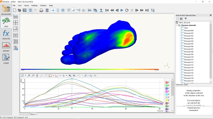
Interactively inspecting test data is critical to understanding what takes place during a test. Often you know just by looking at the data if the test is a success or failure. In addition, the ability to overlay several test runs and visually correlate the results gives you the insight necessary to make key decisions. In DIAdem VIEW, you visually inspect your data and draw conclusions by interacting with it in tabular and graphical forms. You use scroll and zoom cursors to identify peaks and features in your data and different cursor options to graphically delete, fit, or copy ranges of data.
Figure 1: DIAdem VIEW
Key Data Inspection Features
- Create custom layouts to display data in a way that makes the most sense for you
- Synchronize data with video, 3D charts, sound playback, GPS map displays, and more
- Correlate frames with measurement data, play back in real time, or move cursors interactively to compare data to video images
- Choose from 2D axis systems and data tables for data display
- Use zoom and scroll cursors to interactively inspect data
- Mark areas of data traces for copying, deleting, or curve fitting
- Use graph legends to display cursor-related data point values and data properties
- Create VIEW layouts with unlimited numbers of pages
- Visualize, zoom, scroll, and compare traces
- Save your VIEW layouts for future reuse
Analyze Data in DIAdem
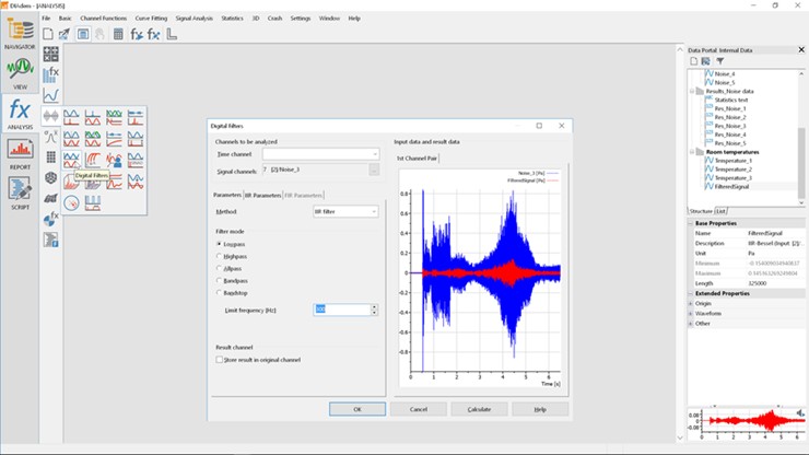
DIAdem ANALYSIS offers a wide range of mathematical routines for analyzing your data. DIAdem separates analysis libraries into groups of similar functionality, and each analysis function has its own unique set of parameters. The DIAdem ANALYSIS functions are completely mouse-driven and require no additional scripting to analyze your data. With the formula interpreter, you can enter your own math functions interactively.
Figure 2: DIAdem ANALYSIS
Key Data Analysis Features
- Use the formula interpreter for basic scientific functions, including square root, sine, cosine, tangent, absolute value, and MOD
- Use tools for integration, differentiation, summation, peak search, root-mean-square, sorting, and averaging
- Calculate curve fits, running averages, and linear regressions
- Extract statistical information including standard deviation, variance, mean values, and minimum/maximum values
- Create powerful histograms from your data
- Perform fast Fourier transforms (FFTs), coherence, transfer functions, auto and cross correlation, and digital filtering
- Design digital filters, including IIR and FIR filters: Bessel, Butterworth, Chebyshev, lowpass, highpass, bandpass, and bandstop
- Conduct 3D data analysis; integrate, approximate, and interpolate matrices and calculate isolines
Report Data in DIAdem
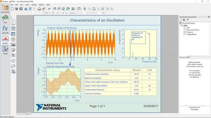
To share results with others and collaborate on projects, you must communicate results clearly and concisely. With a drag-and-drop environment tailored for creating engineering and scientific reports, DIAdem REPORT makes it easy to present and share your results with coworkers. With DIAdem, you can create professional, publication-ready reports using a what-you-see-is-what-you-get (WYSIWYG) report editor and export them to the most common report formats. Design publication-quality reports, share your results with coworkers, and document your ideas using DIAdem REPORT. After creating a DIAdem REPORT template, save it to share with coworkers or to use with other data sets.
Figure 3: DIAdem REPORT
Key Reporting Features
- Use Chart Wizard to quickly design professional report layouts
- Take advantage of easy-to-use, drag-and-drop report construction
- Create multipage reports containing any combination of 2D/3D axis systems, polar coordinates, graphics, 2D/3D tables, text, embedded variables, and function calls
- Scale 2D or 3D graphs automatically or manually
- Display 2D graphs with up to 20 y-axes
- Display data traces with lines, bars, symbols, spikes, differentials, and constants
- Effectively communicate mathematical formulas using Formula Graphic objects
- Create 3D graphs using surfaces, waterfalls, spikes, bars, contours, and color maps
- Generate Web-ready HTML reports
- Embed variables and function calls to create sophisticated reports
- Use one-click export to various file formats, including WMF, EMF, BMP, TIF, JPG, PNG, PCX, TGA, EPS, and PPT
- Print to any paper size
- Export reports to popular word processing or presentation software, including Microsoft Office


